G.I. Gary Reviews:”The Hard Place” #1

“The Hard Place”
Issue #1
Doug Wagner: Story
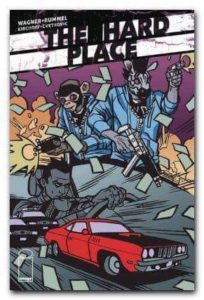
Nic Rummel: Art & Cover B
Charlie Kirchoff: Colors
Frank Cvetkovic: Letters
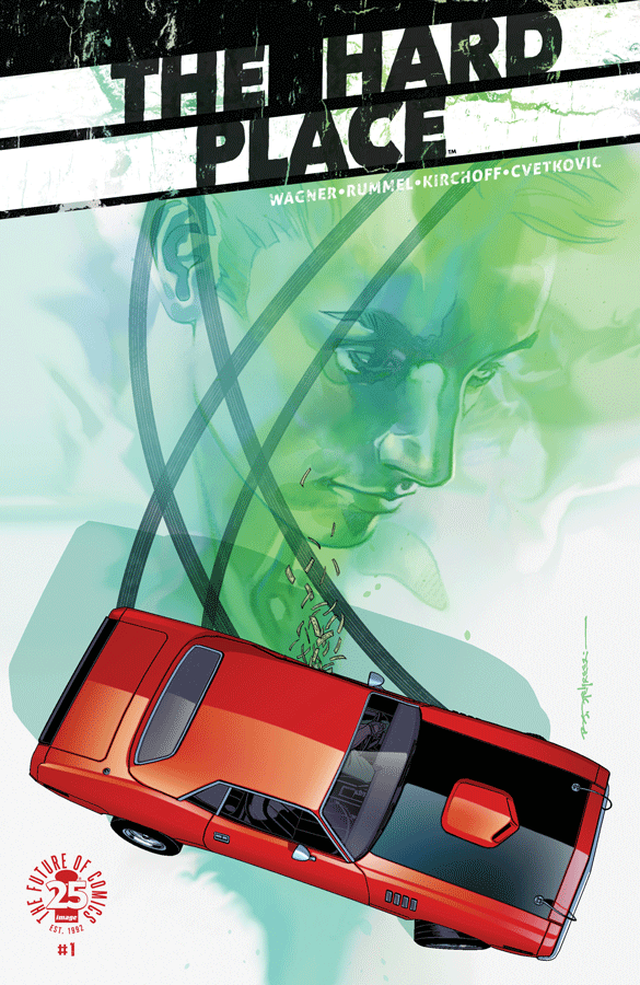
Brian Stelfreeze: Covers A & C

“Image Comics presents A 12-Gauge Production:” and with that line on the interior front cover, you know what follows will be cinematic to some degree. And the plot lives up to that. AJ Gurney is a recently released ex con trying to make a better life after his stint in prison. The story starts with him being picked up by his cop friend Don, in a police cruiser. Don is an instigator and ball breaker, and there’s obviously an unexplored history there. After turning away Don’s temptations, AJ’s first business is to tell an old boss he’s retired. After finally returning home to his dad he starts working on a new life, living on the straight and narrow. However, his past won’t stop returning, and what follows next is best described by the title.

Doug Wagner’s story about this ex-con in reform is nothing we haven’t seen before despite a few new angles. Normally, the ex-con isn’t the wheelman, and does not visit his ex-boss. This suggests that AJ is a man determined to start over, weighs his options, and straightforward. The ending isn’t truly surprising for this first of a five issue miniseries; there’s only going to be so many pages. Doug delivers a few flashback scenes that I found interesting, and I hope he delves into the backstory behind AJ, and hopefully Don, too. The characters’ dialogue is natural and flows with the art pacing. AJ’s character, while not new, is still interesting enough to follow. I may be reading too much into things, but I noticed that AJ’s name is a conglomeration of two legendary race car drivers: AJ Foyt, and Dan Gurney. These drivers were teammates on many occasions, winning LeMans in 1967. Also, Dan Gurney raced a 1970 Plymouth ‘cuda in Trans Am in 1970 (noted because of the 1971 ‘cuda on the cover). Setting this book Detroit is an interesting choice, too. Here is a city that is bankrupt and in turmoil. Depressed neighborhoods and dilapidated buildings litter the modern day landscape of Detroit, which adds layers of visual character.
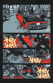
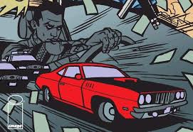
Nic Rummel’s artwork suits the book perfectly. Obviously inspired by street art, his inked lines are heavy, straight, angled and convey the hard tone and street nature of this book. Charlie Kirchoff’s colors compliment nicely giving depth to the art with solid colors that continue the street art theme. He is able to capture the moods of the scene using either deep hues, or faded brights for those few panels. So this gritty urban crime story looks like a gritty urban crime story.

Overall, I liked this book. It’s a strong introduction to the characters and I’m interested to where it’s going in the next four issues. There’s enough going on to maintain interest, but not too much to turn into a convoluted story that leads threads dangling at the end.
I rate this a 3.5 stars out of 5. The book is strong enough to keep my interest, but the next issue won’t be on top of my reading pile.
Until next time!


©2018 Pint O’ Comics | About Us | Contact Us | Site created by One Flight Up Design